Sunday, July 17, 2011

Frames & finishing

From the begining, when i first thought  about starting apple's portrait i was clear that  it was made to be displayed & not to be locked in some folder or drawing book.
Thing is i had no idea about frames and afraid that it is going to get botched if i don't get it corrctly done. And so it actually ended up being locked and forgotten. I did search for ideas on net and could not find anything remotely useful. One day  i decided it enough and set out looking for shops dealing with framing. i settled in for the first shop i encountered.
The end result was surprisingly quite nice and it is now proudly displayed in my living room.
One thing i learned is that drawings are best framed in a bevel (i hope it is called bevel) which introduce space between drawing surface and glass covering. in oil paintings u  don't need glass at all because the material is quite tough.
And so i look towards you, old faithful ones for feedback and advice.
Please don't let me down :-)


Monday, August 2, 2010

Color Pencils lesson series: Apple (Step by steps)

I really took a long time while doing it, I think it took more than 4 months to get finished. To be honest I had almost given up on it many times and in the end I was happy to see it finished and finally paint fixative for closing.
I did one thing here, took many photographs of the picture from my phone camera hoping to cover it in a blog post.
To get started i just added the images. with time I will add more text ...

Apple (finished version)


Basic Outlines with pencil on toned paper


Adding details


Adding dark tones with charcoal with few color pencil details


Readjusting proportions and adding flesh outlines


(Still) More details and colors


Final finished version


Reference Photograph

Tuesday, July 20, 2010

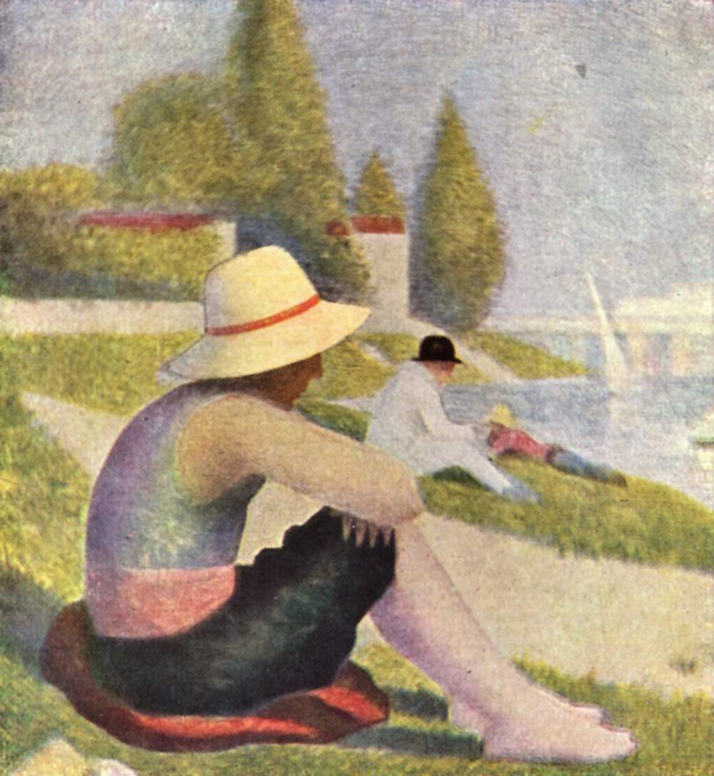
Inspiration: Seurat


Georges Seurat (French, 1859–1891) created mysterious and luminous works on paper that played a crucial role in his brief but influential career. Once described as "the most beautiful painter's drawings in existence," these works captured Paris and its environs, urban dwellers, and cafe singers and other popular performers of the day.


"A sudden stupid sickness carried him off in a few hours when he was about to triumph: I curse providence and death."

Beachboy with Hat


A quick copying from masters lesson.
Charcoal on white paper. Scanned and converted to monochrome using Picnic editor.

Wednesday, July 14, 2010

Post scanning processing for artwork

In the good old analog days life was really uncomplicated. You think about what you need to draw, gather material (or whatever is available) and draw. Work on it till you are satisfied with the outcome and then take a chai/smoke break. If you really like it, you frame it. That's it.

All this changes when you scan it and enter digital world. For starters the scanned images hardly comes close to what it should look. Main pain points are:
  1. Image brightness /contrast
  2. Color tones.
  3. Image sharpness.
  4. Image size (large size convey more details but is difficult to store.)
In other words we need to figure out
  • Which image editing features to use
  • How much of these features to apply for best effect
To illustrate I'll use a recently scanned drawing Keef. It was done with charcoal, graphite and a bit of chalk on blue toned heavy pastel paper (I think).

The original raw master looks like:


Using Auto enhancement


Auto levels tool


Manually adjusted levels


Adjusted using curves tool


So far so good. Now the tough part, which ones look good and which ones don't?

Thats where you are needed, please share your take on which actions actually enhance the piucture